offthewall
Kara-Moon-Collective
Kara-Moon Master

Posts: 2571

|
 |
« Reply #15 on: June 03, 2007, 03:25:21 PM » |
|
 Next try........ 
|
|
|
|
 Logged
|
|
|
|
kara
Kara-Moon, a site built by and for musicians
Global Moderator
Kara-Moon Master

Posts: 4907
Music is my middle name
|
|
« Reply #16 on: June 03, 2007, 03:30:12 PM » |
|
I realy like it Readably, nice colors And it gives a happy feeling impression  |
|
|
|
|
Logged
|
|
|
|
tERMoBLUe
Kara-Moon-Collective
Full Member
Posts: 118
sound-sample-jokey
|
|
« Reply #17 on: June 03, 2007, 03:38:28 PM » |
|
No, you can use anything you want xtra terms - cration music with only samples from here  ...or?...cya tro Well, almost everything: anything but copy protected material. So make sure you only use copyfree material ! We don't want law suites The idea is to make this CD as good as possible, so you only have to respect legal restrictions. this is subjectiv natural and logical ...cya tro |
|
|
|
|
Logged
|
|
|
|
Marc JX8P
Kara-Moon-Collective
Kara-Moon Master
Posts: 1087
|
|
« Reply #18 on: June 03, 2007, 04:01:38 PM » |
|
I really like that design, too. Only thing I'm not sure about is the lettering following the swirl. Could you do one with the lettering just on one line in a smaller font, horizontally and in the bottom 1/3 of the image? I think that will show off better the colours of the swirl while also having a nice contrast between the swirl and the lettering.
|
|
|
|
|
Logged
|
Also known as Marc JXP
|
|
|
offthewall
Kara-Moon-Collective
Kara-Moon Master
Posts: 2571
|
|
« Reply #19 on: June 03, 2007, 04:48:12 PM » |
|
 For Marc....... 
|
|
|
|
Logged
|
|
|
|
|
Moon
|
|
« Reply #20 on: June 03, 2007, 04:57:14 PM » |
|
Yes great!!! The font for "In a spin" is also great and I would even use for "Kara Moon Collective" Great work and good ideas here ! |
|
|
|
|
Logged
|
|
|
|
offthewall
Kara-Moon-Collective
Kara-Moon Master
Posts: 2571
|
|
« Reply #21 on: June 03, 2007, 05:12:41 PM » |
|
Obviously, this is only a test. For the finished product I could do the same size but double width, folded in two, giving front...back with track listings....and inside with info on artists (possibly). Also a tray insert with track listings. (See p10 on my website: http://www.offthewallart.pwp.blueyonder.co.uk/page10.html ) Again....keep the ideas coming. |
|
|
|
|
Logged
|
|
|
|
|
Moon
|
|
« Reply #22 on: June 03, 2007, 06:10:03 PM » |
|
Obviously, this is only a test. For the finished product I could do the same size but double width, folded in two, giving front...back with track listings....and inside with info on artists (possibly). Also a tray insert with track listings. (See p10 on my website: http://www.offthewallart.pwp.blueyonder.co.uk/page10.html ) Aaaahhh... you had me fooled there. But that's not my fault since the test version is allready sooo coool  |
|
|
|
|
Logged
|
|
|
|
rharv
Use in Moderation
Moderator
Kara-Moon Master
Posts: 1059
Glad to be here
|
|
« Reply #23 on: June 03, 2007, 09:23:21 PM » |
|
Very nice.
Lookin' good. I like it in this last version the best
|
|
|
|
|
Logged
|
|
|
|
|
NeoN
|
|
« Reply #24 on: June 03, 2007, 10:19:18 PM » |
|
I'm working on a CD cover for you. I'll just post it for fun, I'm sure you'll find something soon |
|
|
|
|
Logged
|
|
|
|
Laguna Rising
Kara-Moon-Collective
Kara-Moon Master
Posts: 1716
|
|
« Reply #25 on: June 05, 2007, 06:58:58 PM » |
|
Wooow ! I like this version... 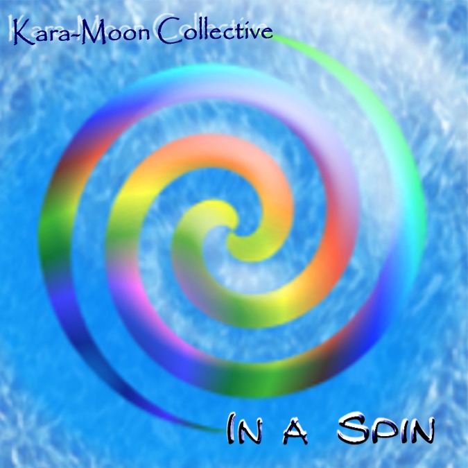 Keep ideas flowing... |
|
|
|
|
Logged
|
|
|
|
kara
Kara-Moon, a site built by and for musicians
Global Moderator
Kara-Moon Master
Posts: 4907
Music is my middle name
|
|
« Reply #26 on: June 05, 2007, 07:53:22 PM » |
|
Yes very readable and beautiful colours  |
|
|
|
|
Logged
|
|
|
|
rharv
Use in Moderation
Moderator
Kara-Moon Master
Posts: 1059
Glad to be here
|
|
« Reply #27 on: June 05, 2007, 11:12:51 PM » |
|
On the Fonts, I like the 'In a Spin' font much better then the 'Kara-Moon' font. The white behind the Kara Moon is distracting, whereas the white behond the Spin is accenting to me.
Maybe make them the same font, just different size?...
|
|
|
|
|
Logged
|
|
|
|
Marc JX8P
Kara-Moon-Collective
Kara-Moon Master
Posts: 1087
|
|
« Reply #28 on: June 06, 2007, 08:28:23 AM » |
|
Off the wall, have you tried doing a negative of the image? That looks awesome, creating a rich organge hue for the background with lots of texture while maintaining the basic image.
|
|
|
|
|
Logged
|
Also known as Marc JXP
|
|
|
|
Moon
|
|
« Reply #29 on: June 06, 2007, 10:47:26 AM » |
|
Off the wall, have you tried doing a negative of the image? That looks awesome, creating a rich organge hue for the background with lots of texture while maintaining the basic image.
Maybe not a bad idea: we could use the negative and the positive, one for the inside of the cd-box and one for the outside, or front and rear. I leave it up to the experts to decide. |
|
|
|
|
Logged
|
|
|
|
|